Blog Posts
Crowdwork Devlog
Visuals-first game development
2025 Mar, 5th
tl;dr? we made a game for global game jam where we focused on visuals-first development. the following post is my development log of our process.
play Crowdwork, then come back and comment to let us know your high-score whether the visual aesthetic appealed to you.1
Global Game Jam (GGJ)2 reminds me of Kumbh Mela or Burning Man - international communities mobilize in spectacular coordination to host events that, though short-lived, are vibrant experiences bursting with creativity and community. Chapin and I decided to join the festivities this year.
I just really love toast and jam… Photo by Jonathan Pielmayer
I've long been a fan of game jams though Chapin and I have a running debate on how the 2.5-day weekend format forms unhealthy work practices. We both agree that a week-long game jam has always felt healthier to participate in. Spacing creative work out and getting enough sleep is simply miraculous. The weekend format encourages participants to maximize their work time by minimizing sleep and working long stretches.
We've participated in a month-long game jam before and I found it was easier to accidentally overscope during planning because it felt like we had a lot of time. One week hits the sweet spot — short enough to stay focused and long enough to rest your mind and body. So upfront, we decided we would work over the course of a week instead of the 60-hour weekend that GGJ suggests.
Before the jam, we decided to focus on visual development through tech art to create a distinct look & style. We used our Prototype Reflection document (we practice what we preach!) to outline this project goal early on. We decided that no matter what theme was revealed, we'd pick our gameplay loop on the first jam day and stick with it - unlike our usual tendency to twist the core conceit fifteen million ways to Sunday.

Check out that clear prototype goal!
Luckily for us, when the theme "Bubble" was announced we immediately realized it lined up perfectly with an idea seed that Chapin had been toying with previously - Crowdwork!
The premise of Crowdwork is a screen of bubbles filling the screen and the core player interaction is tapping to create ripples that pop those bubbles as they expand outwards. In other words:
- fill screen with bubbles
- tap to create ripples
- pop bubbles with ripples
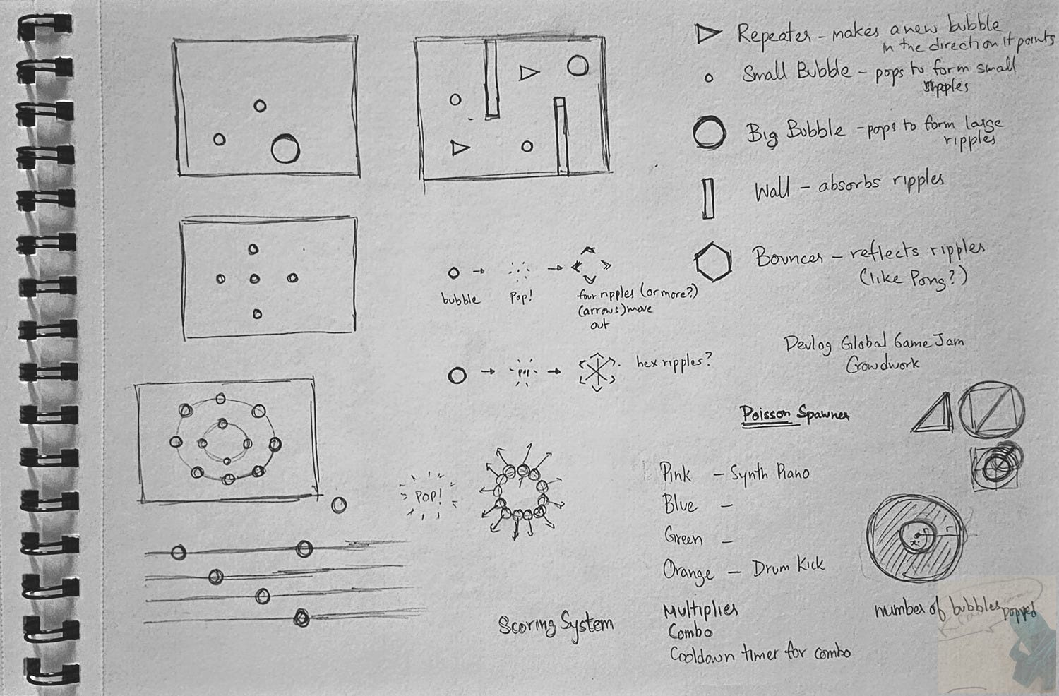
My design sketchnotes from the jam
Chapin began developing the code for the core interactions while I began working on the visuals for the bubbles & ripples. My first step was researching references - how had other developers achieved a transparent bubble look or ripple visuals in Unity? Was there an easy solution for us in the form of a shader someone had already released? I found an impressive array of projects - including someone who had released a project that simulated ripples as raindrops fell onto a ground plane surface. Very cool, very realistic, and very graphics intensive - a little too specialized for our needs.
I also landed on a set of shaders for the Universal Rendering Pipeline (URP) in Unity that I used extensively as reference to create my own shaders using ShaderGraph, Unity's node-based shader editing tool. It was a great experience working with a node-based shader editing tool. People usually talk about shaders like they are a mystical art (and they still feel a touch arcane to me) — but experimenting with them in a visual graph format felt playful and gave me a better sense for how the shader was processing different inputs.
I also graduated Shaders 101 from YouTube Academy which gave me a better sense for what common, cost-effective shader solutions look like. For example, using scrolling UVs is a simple and inexpensive way to add motion to water surfaces; but you can also use it cleverly to make quick flame effects, glowing energy portals, cloth capes, and more.
The Background: Realism to geometric shapes
1. Toon Pond
Initially, I imagined the gameplay taking place on the surface of a pond with realistic water and perhaps 3D props like plant models in the background. Somewhat in the style of the original Koi Pond app for the iPad. Based on this, I decided to try using a realistic water surface shader. As a bonus, it also calculated foam particles at the top of the water surface waves and also adjusted the color for the water based on depth.
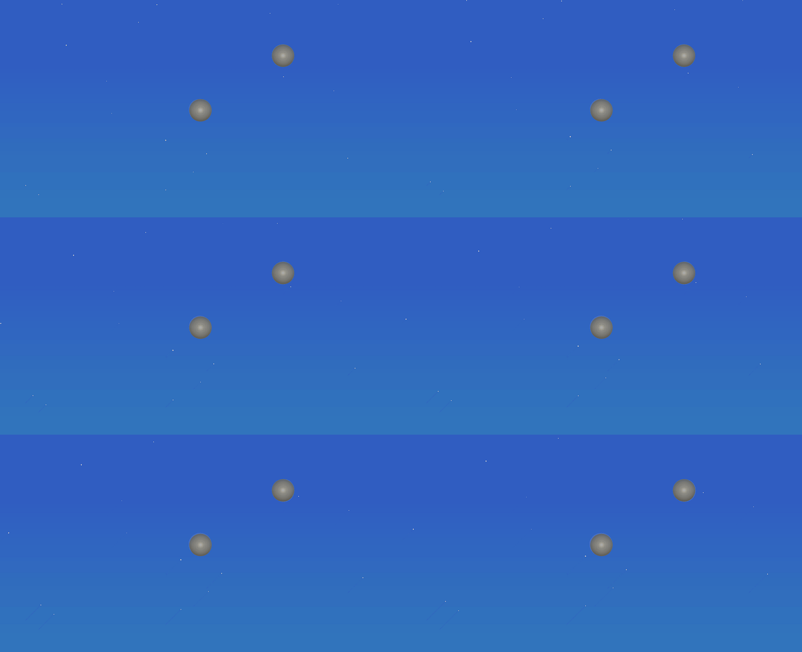
Though this depth effect felt exciting to me, it just wasn’t coming across in the top-down 2D perspective our camera was using. Also, the shader was quite intensive since it was calculating lighting and shadows and depth through the transparent surface of the water. With more experience, I’m sure we could have optimized it but we decided that we didn’t want to go for a realistic style.
2. Neon Lights
The vision of Crowdwork in Chapin’s mind was heavily inspired by PAC-MAN™ Championship Edition DX+ and Geometry Wars. The visual style of the former reminded me of a neon-lit night matsuri crossed with a techno dance party. The latter offered simple geometric shapes with bold, neon outlines and a mesh-grid background that rippled and warped in reaction to the player’s bullets. Both games feel inspired by a punchy, neon arcade aesthetic that you can pick out of a lineup from a hundred yards away.PAC-MAN Championship Edition DX + Launch Trailer on YouTube
Geometry Wars: Retro Evolved 2 Trailer (XBLA) on YouTube
It always feels bad to kill your darlings but better earlier than later - we agreed to scrap the realistic pond in favour of this neon, geometric look. I continued using the realistic water shader and tried using the depth effects to create the grid lines in the background. It was like using a hammer to drill in a screw - I was using the wrong tool for the wrong job.
3. Vaporwave
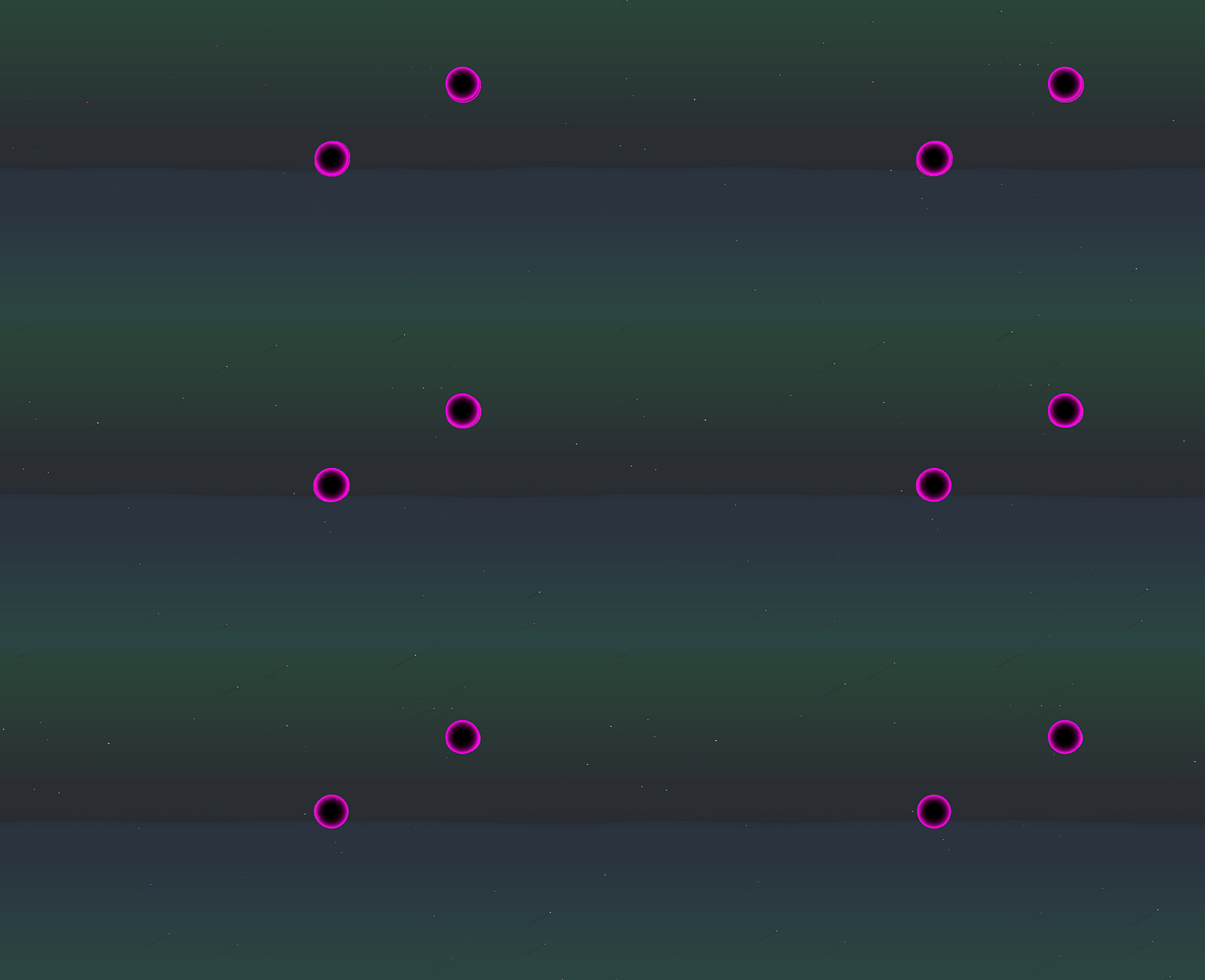
While iterating on the colors of the background, my mind drifted to vaporwave as an aesthetic. I felt that we could take inspiration from its synth-ey, ambience heavy aesthetic and eye-catching blue and pink neon color palette.
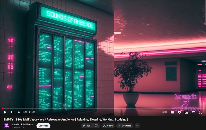
This also served to set the mood as we worked.
I was still stuck to the idea of using the realistic water shader in neon blue and pink, but you can see it still didn’t do justice to the fluorescent brightness and vivid energy that vaporwave oozes with.
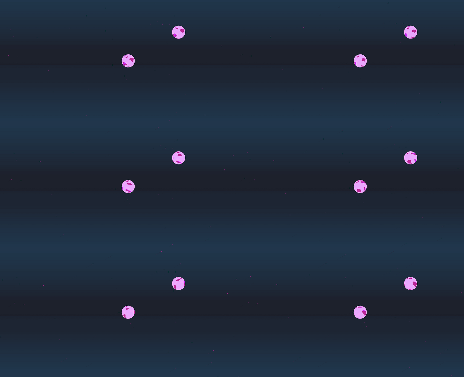
4. Checkerboard
Sometimes the simplest solution is the best one. While discussing how to proceed with the background visuals, we discussed and referenced a number of puzzle games that used simple background visuals along with light motion to great effect. After all, we didn’t want the background details to distract from the main gameplay elements - this was a challenge we were considering while working on Skadi Tower as well.In a flash of inspiration, we figured we could try a checkerboard pattern for the background. One quick repeating sprite pattern later and we were quite pleased with the result! Ever the diligent student, I figured we could apply a scrolling UV to the same pattern to scroll the background endlessly. Some color adjustments later and we were quite happy to wrap up the background visuals for this protoype.
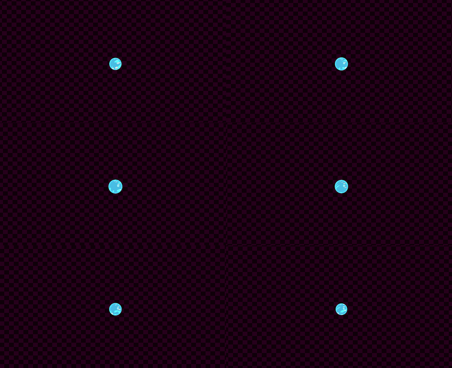
The Bubbles: Lessons in style(ized looks)
1. Realistic
We decided on implementing our bubbles objects using Unity Sphere primitives so that we could lean on Unity’s 3D collision system. We’ve found it easier to use 3D functions and components in Unity even if we present a 2D view of our game to the player. Trying to use the 2D functions and components always feels like we’re fighting how Unity would prefer us to setup the game. After all, it does have ‘Real-time 3D’ in the name. Also, I could slap on the same shaders I was using to our 3D sphere models.Since I worked on the background and bubbles concurrently, my first bubble version also used a realistic bubble shader. Transparency and performance aside, it didn’t stand out visually so I quickly moved away from it.
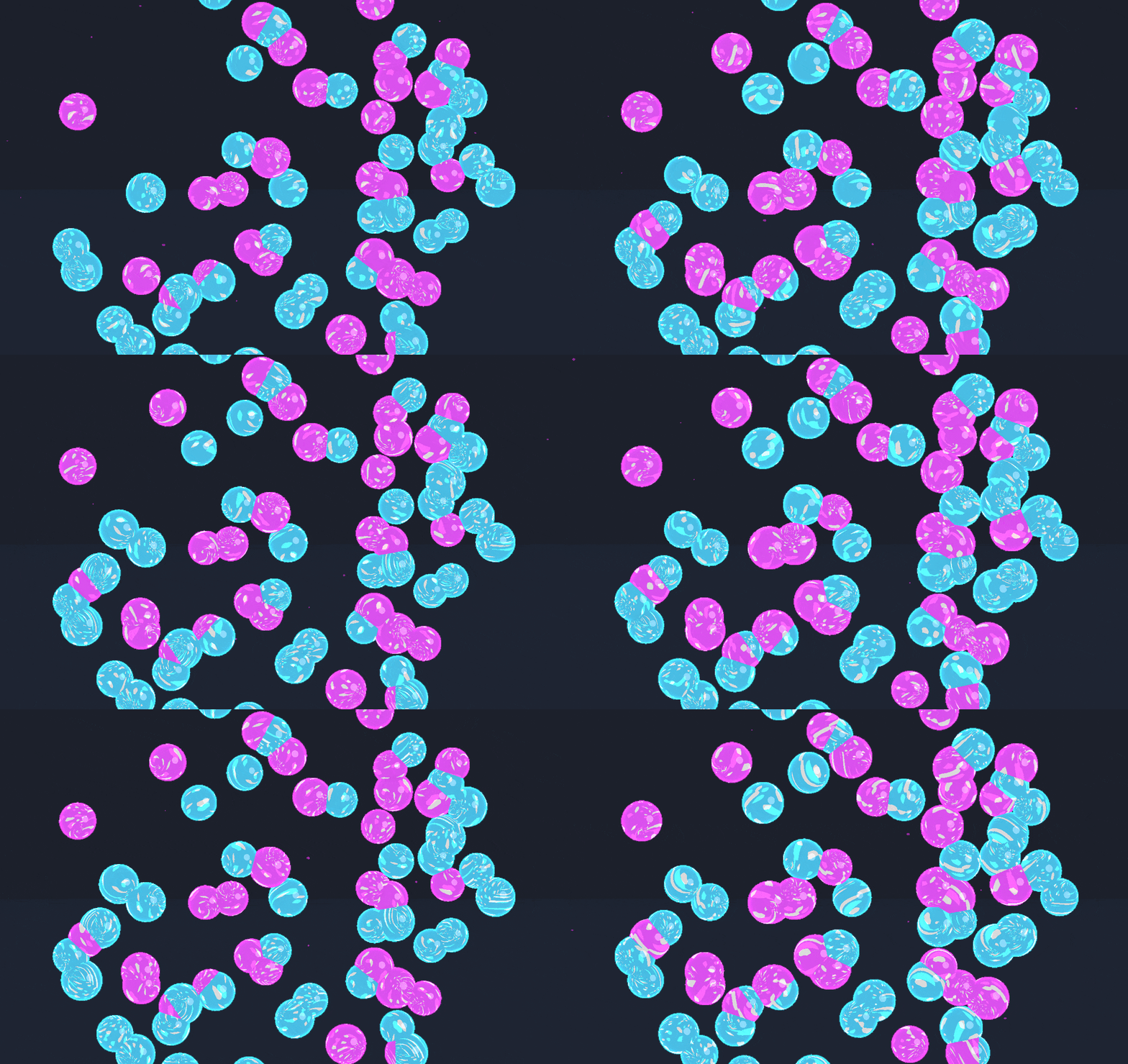
2. Toon Shader
It’s been millenia3 since toon shaders were all the rage in indie dev circles but I (and surely others) am still partial to their look. Toon shaders work by breaking the color and lighting on an object into discrete areas which give the finished visuals nice clean chunks of color.
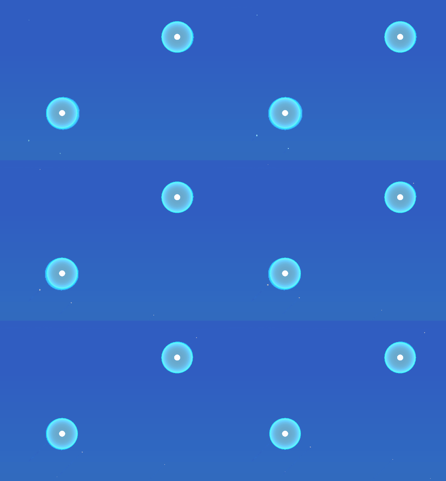
I tried an aqua blue against the realistic pond background setup and I think it was a suitable first pass.
3. Camo Shader
But wait! ‘Can we make these bubbles visually more interesting?’ asked Chapin. ‘Let’s see!’ I answered, trying on all the shaders from the shader pack on our bubbles, like my cousin trying on clothes at a thrift store. So cheap! So easy! So many styles!I fell in love with this ‘Camoo’4 shader and the zany visuals it produced on our bubbles. You can see how I was also experimenting with the color palette for the bubbles, choosing ‘light pastel’ colors and creating a corresponding ‘dark neon’ version for each bubble.
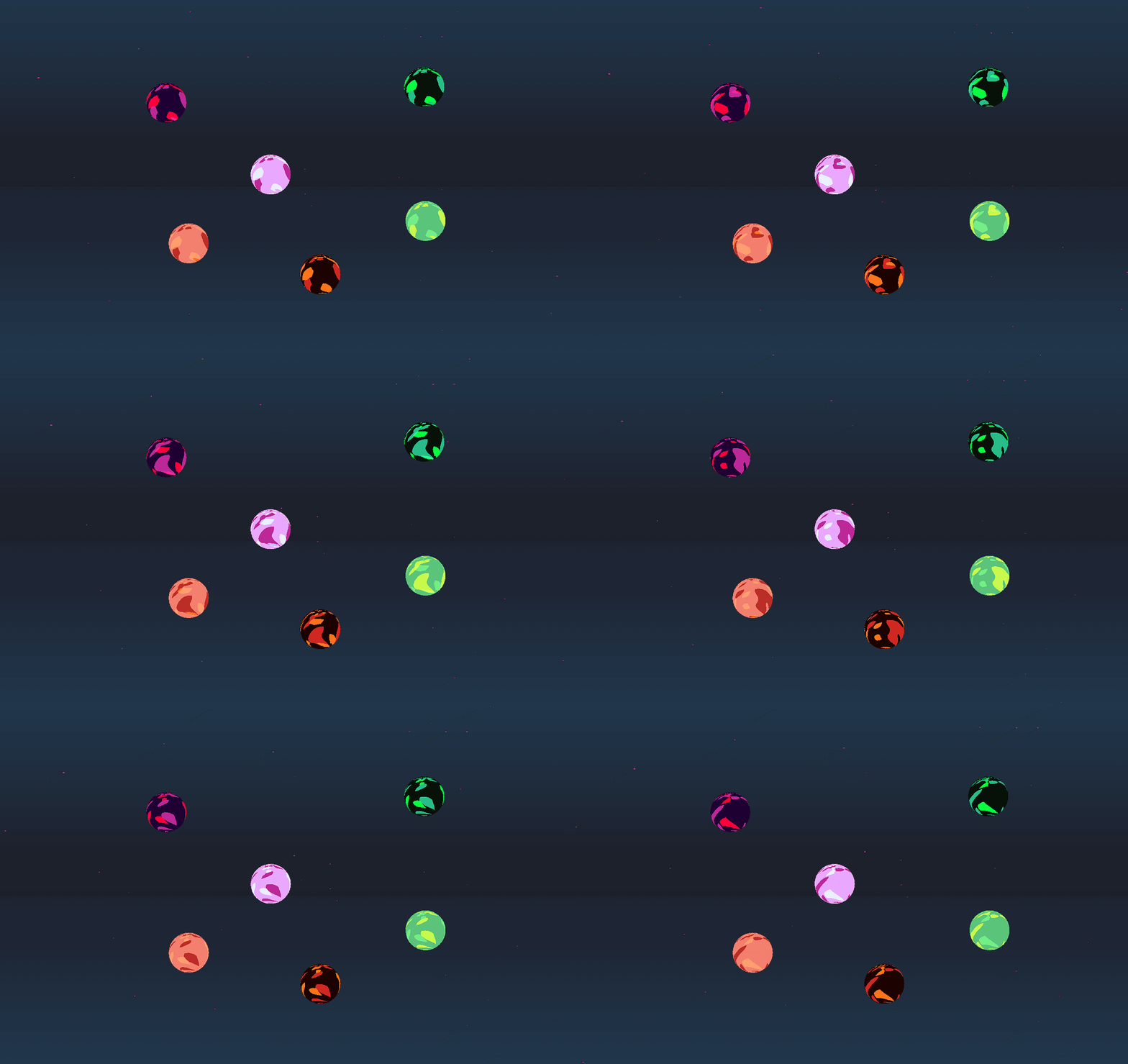
Alas, this was not the brief though it made for fun (and chaotic) visuals:
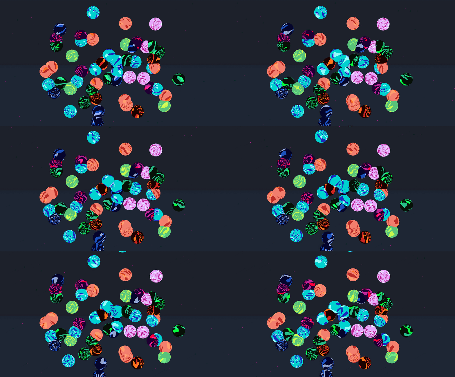
3.5 Breathing Bubbles
Meanwhile, since our actual development didn’t follow each element so linearly, we worked on a ‘breathing’ script to give the effect of motion on the bubbles even when idling.
4. Neon Bubbles
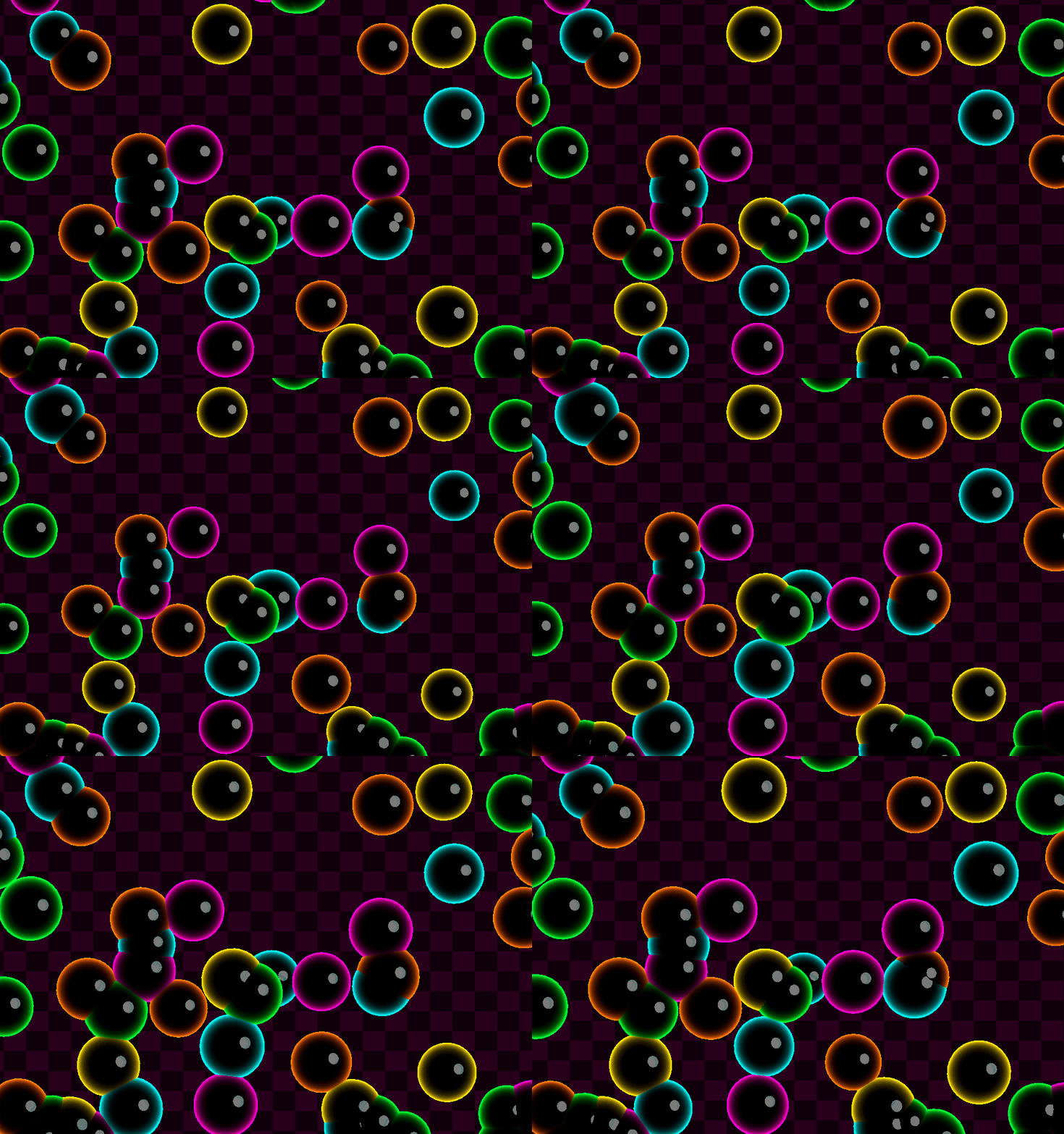
Back to the visuals - we decided to go for less/no funky visuals on the bubbles. I decided to hit the sketch pad and rethink how we wanted the bubbles to look. That’s when I thought of digging deeper into the vaporwave aesthetic and make the bubbles dark with a neon color outline.Guess, what? A toon shader would be perfect for that. After backtracking and tuning the shader for pink and blue bubbles, I experimented with a few more colors and thus landed on our final color scheme.
Melodic Audio
Our friend and long-time collaborator on audio design, Seb figured an ingenious solution for the bubble popping sound effects. He picked a single chord and gave us separate audio clips for each note. When a bubble is popped, the game picks one of those notes at random. Our previously stubbed in sound effects sounded messy at best and cacophonous at worst. After Seb’s audio clips, we had procedural audio where every pop sounds good and layers additively with each other.
Juice, Juice, Baby
Though we had settled on the overall visuals, we worked on juicing5 the micro-interactions a bit more. The breathing bubbles were part of this and they gave a nice sense of motion to the game even when the player was idling. We also made the bubbles size increase when the player mouses over them to highlight the active bubble.Other juicy details included changing the score text popup color to the color of the corresponding popped bubble, updating the scoring UI as the player scored points, adding a wave start sound effect and completely forgetting to actually make the combo number count in the scoring formula.
Conclusion
This was one of our favourite game jam experiences both in terms of process and finished game (even though we ironically chose to ignore the finish until the end). It was great to pick a game loop quickly and just start making the game ASAP - cliched advice but it feels great in practice.The encouraging part of approaching the design visuals-first was that at every stage we could share screenshots and GIFs with our players who were excited to see the visual progress. It also felt good to give time to developing/juicing up the micro-interactions towards the end. I think each little detail added up to a lot more than the sum total of the game experience.
That’s a wrap on this devlog!
Here’s the link to play Crowdwork, and thank you for reading.
1. absolutely tell us your high scores
2. A Game Jam is like a hackathon for games; people come together to make a game in 48 hours under constraints or following a common theme.
3. Not literally. A decade or less, maybe.
4. Camoo, as in Camo, as in Camoflauge. It was probably intended for use on a player model to indicate a status effect. In the spirit of kit-bashing, I am very happy with my spherical implementation of it.
5. Yes, I promise you this is a real term we use in game design and it always makes me hungry.